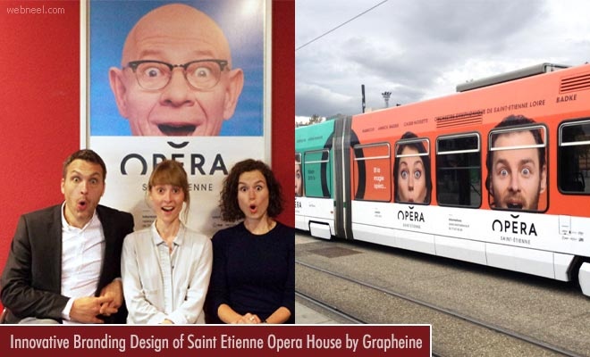
Saint-Etienne Opera House is an important landmark and a cultural structure of the city. Grapheine worked for 6 months, redesigned the brand identity and has given a whole new glow to the Opera House. The motive of recreating the identity is to establish a close relationship with the people of Stephane through simple communication. It is redesigned with a new name of 'Opera de Saint-Etienne' instead of 'Opera Theatre' to have a bound with historical audiences and also to increase the potential audiences. The new 'Comedie de Saint_Etienne' has theatrical programming. One of the wonderful architectural beauty is the design of the opera rooftop as it looks like it is giving a sign. The circular hall gives comfort and good acoustics for the audience to enjoy. The letter 'E' in Opera is stressed with the curve which reminds the building's roof and the 'O' shape brings the mouth singing which is lovable and admirable. Let us scroll down to enjoy the innovative branding design process of Saint-Etienne Opera recreated by Grapheine.
Read Full Post here: Innovative Branding Design of Saint Etienne Opera House by Grapheine
See all Branding Designs, Design, Web Design posts | For More Design Inspiration | Daily Inspiration
Design Inspiration Blog, shares most inspired graphics for designers, Illustrators, 3D Animators and Fine art professionals.
Tuesday, August 10, 2021
Daily Inspiration: Innovative Branding Design of Saint Etienne Opera House by Grapheine
Innovative Branding Design of Saint Etienne Opera House by Grapheine
Subscribe to:
Post Comments (Atom)

No comments:
Post a Comment