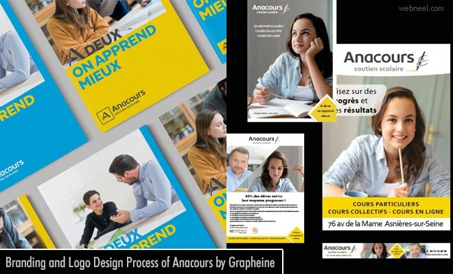
Anacours, a leading name in tutoring for the past 20 years recreated it's branding and logo design with the innovative Grapheine designers. To withstand the highly competitive world of tutoring Anacours needed a strong visual brand identity. As in all other cases the new design evolved from their old brand design but with modernity and much clear vision to reach the targeted audience. The symbol handwritten is now part of the letter A and it clearly holds the values of Anacours : trust, proximity and quality. There is a flexible option of horizontal and vertical versions of the logo which helps in both print and digital media. The slogan "A deux on apprend mieux"(two people learn better) includes the new emblem with its new typographical composition. When the yellow colour of the emblematic representation is retained, a cyan blue colour palette is applied to enhance the identity. Here we share the new branding and logo design process of Anacours by Grapheine.
Read Full Post here: Branding and Logo Design Process of Anacours by Grapheine
See all Branding Designs, Design, Web Design posts | For More Design Inspiration | Daily Inspiration
Design Inspiration Blog, shares most inspired graphics for designers, Illustrators, 3D Animators and Fine art professionals.
Monday, September 27, 2021
Daily Inspiration: Branding and Logo Design Process of Anacours by Grapheine
Branding and Logo Design Process of Anacours by Grapheine
Subscribe to:
Post Comments (Atom)

No comments:
Post a Comment