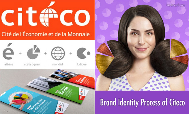
Citeco is Europe's first museum dedicated to economics which gives a better reach to the economic culture through educational and fun way. There are collective games, videos and multimedia installations that can be accessed by the citizens. Citeco wanted to develop a cohesive and professional brand identity as a part of an effective branding strategy. The primary need of a logotype is to reach and communicate the audience in an effective way and hence grapheine created a graphic layout that allows warm and keen brand identity. The design of the letter "e" in Citeco resembles the world map which ensures global reach and a pie-chart. The sphere shows latitude and longitude which symbolises the exchange of economic resources. The wordmark is done in Fedra font type which supports the geometric aspect of the emblem. To humanise the entire concept the hairstyle and clothing of the visitor are released which adds humour to the codes of the economy like curves, histograms and graphs. Here we share a few professional branding identity designs of citeco by design agency Grapheine.
Read Full Post here: Professional Brand Identity Process of Citeco by Grapheine
See all Branding Designs, Design, Web Design posts | For More Design Inspiration | Daily Inspiration
Design Inspiration Blog, shares most inspired graphics for designers, Illustrators, 3D Animators and Fine art professionals.
Tuesday, June 1, 2021
Daily Inspiration: Professional Brand Identity Process of Citeco by Grapheine
Professional Brand Identity Process of Citeco by Grapheine
Subscribe to:
Post Comments (Atom)

No comments:
Post a Comment